The History of
Storyboarding
The idea of Storyboarding was credited to the Disney
animator Webb Smith in 1933 for the Disney short “Three Little Pigs”. It is
said that he came up with the idea of drawing the scenes on separate pieces of
paper and pinning them up on a board to visualise a sequence. Disney would
later be the first studio to create a department for Storyboard Artists which
has now become an essential role and department to have for the pre-production
of any media. By 1937 all American animation studios were using storyboards.
As you can see this Storyboard seems very pieced together with the images stuck on the separate piece of paper while the descriptions are very brief. The frames are all different sizes while the drawing are quite detailed. Considering animated films back then were all hand drawn it could've served as practice for the actual animation. It is clear visually that this was the FIRST Storyboard as everything appears to just be thrown together and has no clear format.
However, the first live action film to be completely storyboarded was “Gonewith The Wind” in 1939 which was done by William Cameron Menzies who designed
every shot. Storyboarding for live action films later became popularized in the
early 1940’s and would go on to become an essential part of previsualization
for all films. It is now an essential process of creating any media.

This time around the storyboard focuses more on the visuals rather than the dialogue and sound. The detail on the visuals is much better, even adding color. The lack of detail in sound and dialogue is because dialogue can be improvised for the most part.
An early
film to join the trend of using storyboarding was Citizen Kane in 1941 which
has since been regarded as one of the best films of all time.

Unlike Gone with the Wind, Citizen Kane adds a bit of text in order to pay attention to transitions and shot types where as Gone with the Wind focuses just on visuals.
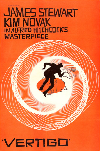
Alfred Hitchcock is a famous filmmaker and influencer who heavily relied on storyboards. So much so that it was rumoured that he never looked through the camera’s viewfinder. This was later proved to be untrue. However, he did quote that “They were the essence of film. Without Storyboards there would be no film”. Someone as infamous as Alfred Hitchcock praising storyboards as much as he did only solidify their importance further to all filmmakers. Saul Bass and HaroldMichelson were people that Alfred Hitchcock entrusted his storyboards too. SaulBass was well known for his of title sequences and film posters. His actual for Hitchcock includes the poster he made for Vertigo (1958) and general storyboarding.

Harold Michelson was an American Production designer who worked as a storyboard artist on many films throughout the 1940s-1990s. While he served under Alfred Hitchcock he worked on The Birds. Storyboards back then were all hand drawn on paper and hung up on boards.

With this Storyboard, Michelson focuses alot on the visuals but also includes the timings of each shot as well as some detail about whats happening in the shot. This shows how text would slowly be incorporated with film storyboards to make them as detailed as possible for when it comes to filming.
Nowadays storyboards are done all on the computer and then further evolve into an animatic which adds a voice over and maybe even subtle animations to help visualize it more. It shows how technology has influenced the pre-production process as it helps the cast and crew visualize more.


Unlike Gone with the Wind, Citizen Kane adds a bit of text in order to pay attention to transitions and shot types where as Gone with the Wind focuses just on visuals.
Alfred Hitchcock is a famous filmmaker and influencer who heavily relied on storyboards. So much so that it was rumoured that he never looked through the camera’s viewfinder. This was later proved to be untrue. However, he did quote that “They were the essence of film. Without Storyboards there would be no film”. Someone as infamous as Alfred Hitchcock praising storyboards as much as he did only solidify their importance further to all filmmakers. Saul Bass and HaroldMichelson were people that Alfred Hitchcock entrusted his storyboards too. SaulBass was well known for his of title sequences and film posters. His actual for Hitchcock includes the poster he made for Vertigo (1958) and general storyboarding.

Harold Michelson was an American Production designer who worked as a storyboard artist on many films throughout the 1940s-1990s. While he served under Alfred Hitchcock he worked on The Birds. Storyboards back then were all hand drawn on paper and hung up on boards.

With this Storyboard, Michelson focuses alot on the visuals but also includes the timings of each shot as well as some detail about whats happening in the shot. This shows how text would slowly be incorporated with film storyboards to make them as detailed as possible for when it comes to filming.
Nowadays storyboards are done all on the computer and then further evolve into an animatic which adds a voice over and maybe even subtle animations to help visualize it more. It shows how technology has influenced the pre-production process as it helps the cast and crew visualize more.
Film

This storyboard from Order of the Phoenix (2007) is like the
previous film storyboards where it concentrates heavily on the visual side of
thing. The storyboard also accompanied by arrows, which direct specific key movements.
This helps the cast and crew understand their movements clearer for when it
comes to filming, everyone knows exactly what to do to avoid reshoots and
ultimately save money. Like the early Film Storyboards, there is no attention paid
to the dialogue side of things. Again, this could be because dialogue in live
action films can be improvised for the better. Also all the necessary dialogue
would be documented on a script so it would not need to be present on the
storyboard. The attention to detail in the visuals is tells the cast and crew
what the Mis-en-scen will look like in the shot with exact props and costumes
in each shot. It also presents the location of the scene to be some kind of
warehouse with the massive shelves shown on either sides of the cast.It also
shows what the actor’s makeup and hair will look like for the shots they are
present in to direct the make-up artists on set.
The characters themselves must be very detailed so that the
emotion and direction they are facing are clearly shown for the actor sake.
Realistically there should be some annotations just to clarify what is
happening as for some, just the visuals is not enough. Perhaps the visuals
could be coloured just to add a bit more depth and clarity to the image. Adding
these would overall turn the storyboard into an easier guide for everyone on
set. As for this Harry Potter storyboard, the crew might be confused with the
lighting in the scene as the first two frames are clearly dark. However, in the
3rd and 4th frame it appears to be a bit lighter but then
back in the 5th frame it gets darker. A bit of colour could make it
clearer as to whether the lighting is dark or light. Having text could specify
this even further as it could have specific lighting instructions for the
Director. This scene from Order of the Phoenix appears to possibly feature a
lot of CGI effects in it. This makes framing the scene a lot more important.
The actual live action parts of the scene has to be framed perfectly so that
when the CGI is added later in post-production, the scene looks good with both
elements.

However, when you compare live action feature films to
animated feature films. There are some key differences between the two. My 2nd
example is from Toy Story 2 (1999) which already you can notice some big
differences. The first major one is that the visuals are now accompanied by
dialogue. Unlike live action films, dialogue has to be animated onto characters
so knowing what each character is saying in each shot helps the animator know
how to animate the mouth movements of characters saying the line. Another thing
that sets this apart from Order of the Phoenix is that there are numerous
drawings of the same frame but with different movements to show motion. This is
unlike the arrows in live action storyboards as it also helps with the timing
of each frame. In this instance, it helps the animator with the timing of the
dialogue. For example, the shot of them in the vent starts with our characters
in the far distance of the shot. We know they get closer to the camera as the
next drawing of the same shot shows them drawn closer to the camera meaning
they are approaching the camera. Where this helps with timing is the 3rd
drawing of the frame where it signifies that Buzz Lightyear has a voice line at
that specific moment in the shot and unlike the previous drawing, the 3rd
one has Buzz’s mouth drawn open to show he’s speaking. Also unlike live action,
Animation has a free camera meaning that the camera can really be placed
anywhere within the shot. The Mis en scen is all digitally created where as it
all being placed in Live action films. This helps the animator as spacing is
not as important as it is with live action films. The attention to detail must
be very specific, especially in Toy Story’s case where it was the first
complete CG animated feature length film so they had to be careful stepping
into new territory. Here is an example of an animatic also from Toy Story 2.
Video Games
Story boarding a video game is done by having the characters
and scenes separately and then placed into order. The storyboards for games are
done before a screen is even interacted with.
A big focus with video game storyboards is the characters themselves
because interacting with characters in a game is essential to push the
narrative in the game. So, character storyboards are done in order to perfectly
capture their look and personality to make them interesting when they are
eventually scanned into a game engine. My example is of Handsome Jack from Borderlands2 (2012).


The image on the left is the original character storyboard
and the image on the right is the finished in game character model. As you can
see a lot of effort and detail has been put into this character storyboard. The
first thing that stands out from previous storyboards is that colour is added.
This is because every little detail must be in the design before being imported
onto a computer for the finished model. This storyboard gives us multiple
angles on the character such as 2 complete wide shots from both front and
behind as well as 3 close ups taken from every possible angle of his face. This
is to incorporate little details up close as well as giving us the full design
to refer to. When you look at the finished model the only noticeable difference
here is the hair. Apart from this everything has been directly derived from the
original design which only goes to show how these initial storyboards are significant.
Character storyboards would have to be completely redone repeatedly until the
games director was satisfied with the finished design and approved it to be
imported. Handsome Jack has since gone to be put on numerous lists for being
one of the greatest videogame villains if not, the greatest. A big part of this
is his visual design that comfortably matches his smug and arrogant personality
in the game, especially in a game like Borderlands 2 which constantly reminds
you of his presence.
Video game makers also must design the environments in which
the narrative takes place in and are also later imported to form the physical
world of video games. These are like the mis en scen created in Toy Story 2.
However, unlike the mis en scen in Toy Story 2, these worlds are interactable
with players, so the designs must be even more layered than an animated film.

Here is an environment concept art for Borderlands 2 which
shows the alien world of Pandora (The games primary setting). The Borderlandsseries is well recognised for its chosen animated visual design. This helps the
game stray away from realism and is shown clearly from the hard-black lines
drawn on the setting to make the bright colours stand out more. This shows
clearly that graphics are not realistic at all.
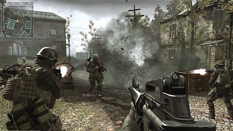
When you compare this to a game that takes a more realistic
approach like the Call of Duty franchise, the storyboard must reflect this in
order to make it clear to the designers what looks they’re going for.


As you can see unlike Borderlands, colours are more blended
together to look more real as its set on Earth in the modern era. The character
design is also a bit more detailed as its going for photo realistic graphics
where as Borderlands goes for a comic book art style. Both game franchises are
First Person shooters, but their designs visually and in game graphics make a
drastic change between the pre-production process when it comes story boarding.
Overall, Video game storyboards have to be the most detailed when it comes to visual design as the world that is created is interacted with and changes based on the players decisions. Similarly to animation, video-games have a free camera as its animated. However, the camera tends to stick to the player as the move, with the exception of in game cut-scenes. These are commonly done in 1st or 3rd person and track the players movements.


TV Show
Storyboards for TV Dramas are very similar to feature film
in the sense that they focus a lot more on the visual side.

This Storyboard from the show Vikings is like the previous
film storyboards where the visuals are heavily detailed and little to no text
and dialogue is provided. Unlike the Order of Phoenix, there are no arrows of
motion present in this storyboard despite their being clear movement in the
frame. This is likely because Storyboard artists must draw out numerous
episodes worth of content and can’t spend their time pointing out the obvious
by drawing arrows. This also might make the shot clearer to the Director of
what the shot will look like as a big arrow would obstruct the overall shot.
The mis en scen could be argued to be more detailed as a show like Vikings is
set in a different era. This means most of the set, props and costume would
have to be made for the show to stay true to its time era unlike videogames and
animation where mis en scene is digitally created. It is clear to the director
that the setting here is some type of field which is later to be turned into a
Battlefield. This scene also involves working with animals as the storyboard
clearly shows people riding horses. This means the storyboard has to be clear
visually so that the director and cast know what they’re doing with the animals
to avoid obstructing and guidelines of animal safety. As a battle is taking
place, a lot of this scene is going to have choreographed fight scenes which
means the actors or stuntmen are going to have to know their precise movements
in order to make the scene work.
However, when you compare it to a subtler TV Drama like
Breaking Bad. Some changes are quite clear. The first being the inclusion of
multiple drawn frames of the same shot. Similarly, to the Toy Story 2 one, this
helps with the timing and pace of the shot as well as showing us key movements
as opposed to drawing the arrows. This story also utilises the motion arrows to
make the act of motion even clearer in these shots as this car scene would have
to be choreographed it means the stunt driver knows what he’s doing when he
sees the storyboard thus there would have to be less reshoots and budgets are
saved. The shots are also labelled with numbers as well as the scene being
labelled so the Director knows exactly where this scene is taking place in the
story. This Breaking Bad storyboard is much better compared to the Viking storyboard
as the detailed visuals and inclusion of arrows makes it clearer as to what’s happening
on screen. The shot and scene labels also help pin point where this is taking
place in the story.
Summary
The storyboard for Film and TV shows are quite similar in the way that they both focus more on the visual side of things. They also both include direction arrows and may include some annotations to make things clearer. Unlike the both of these, Animation and Videogames must include annotations as dialogue and movement have to be strictly animated. Animation also has numerous segments from the same shot drawn to help with both movement and timing. This isn't unheard of for the others as the example from Breaking Bad also does this. Videogames and animation have a lot more freedom when it comes to to story boarding as the camera angle and mis en scen are all digitally created which allow basically anything to happen in shot where as TV shows and Film are limited by cameras, lighting and mis en scen which has to be constructed or later added in as CGI. Unlike the rest of them, Videogames go into a lot more detail when it comes to their character design and backdrops. This is because the characters and settings are intractable and can sometime change depending on the players choices and decision so for the player to have an immersive experience, these models have to be thoroughly detailed. The narrative may also change for a Video game based on these players decisions which can also change the environment the player is in. For this numerous storyboards with the different story outcomes have to be done to make sure each possible outcome is visually documented. So the storyboard for Borderlands is very different compared to Toy Story 2. For one the age rating and genre for both are vastly different. Borderlands is a First Person shooter which is rated an 18 aimed at young adult males aged between 18-24. On the other hand Toy Story is a kids film rated a U and aged at toddlers. This will significantly impact what narrative is conveyed for each and will inevitably lead to their storyboards being very different. Borderlands will tend to have a lot more on screen violence where as Toy Story will be kept at a family friendly level. Similarly the storyboard for Breaking Bad and Order of the Phoenix have very similar formats but as Order of the Phoenix is a feature length film that is rated a 12 by the BBFC guidelines due to its discrete violence where as a TV shows such as Breaking Bad is rated an 18 for its graphic violence and drug use. This again will all have to be story boarded so when it comes to the violence, the film crew will have something to reference. For example take the Gus scene at the end of season 4. For this scene to be done properly, the make-up artist/ CGI artist would have to know exactly what Gus would need to look like.


